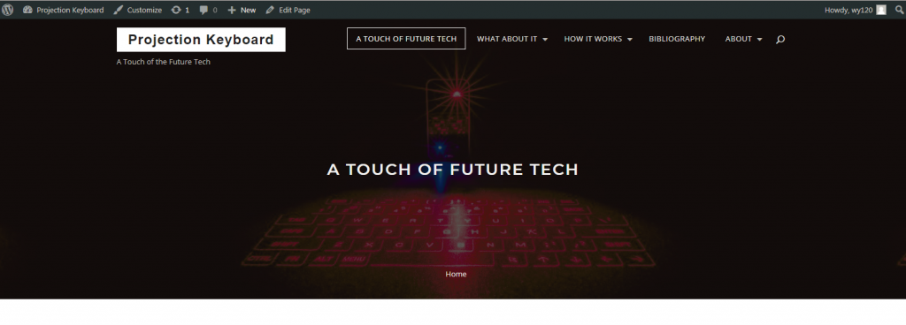
The theme that we choose for our website is Bizplan, which is a decision we make together after a lot of excruciating experiments–every theme has its pros and cons. After we go through four or five themes, this theme eventually wins for a couple of reasons. Firstly, it is concise and does not have a lot of fixed formats, so that we can easily customize it and adding to it elements that are favorable during the process of editing the content on our website. Secondly, it features frames around elements like site title and main menu buttons, which conforms to the pattern of the projection keyboard, the subject of our website.
Since we only have a very humble knowledge of HTML and CSS, we have not changed a lot of codes of our website, but we do try our best to modify some small features to make our website look more attractive, such as the font type and font size of the site title (Projection Keyboard), the site description (A Touch of the Future Tech), the primary menu, etc.


The most significant change we have made to the codes of our website is an attempt to remove the default grey layer on the header image, as shown in the comparison above. The layer gives us a headache for it compromises the quality of our header image. We change the parameter for opacity to zero in line 4324 of style.css to fix this problem. It sounds easy but the tricky part is to locate the line of code that controls the style of this specific element. Besides, in the “About the Tech” page, we enable in-text notes and works cited to link to each other. To achieve this, we add some HTML codes to the WordPress text editor.
We also want to give credit to Lufy, an excellent photographer who produces the header image of our website using long exposure techniques. He is a roommate of one of our group members and also a student at GWU. Without this extraordinary header image, our website would certainly be less attractive.
We use Elementor, a useful WordPress plugin, to manage the layout of our pages. This plugin allows us to create and manage blocks on a page to input our content. An example of this practice is the Cyclops page, where we divided the content into two columns. The icons we use in the navigation of our front page are also from Elememtor. Though this plugin is versatile, we choose not to make our website much fancier for the purpose of simplicity. We want to present our content in an appropriate way to you, but not to distract you by styles.
Thank you for reading through our website. Hope you have got something useful from it. Thank all of our group members for their semester-long hard work. They have indeed learned a lot from the course and this project.
If you reach this line, you are probably Professor Barba and Professor Osborn. Thank you for all your suggestions along the way of this project. They are very insightful. And from the bottom of our hearts, this course, though it is one of the two required courses of CCT program, is terrific.